01 / Brief
Product clarity.
A considered next step.
Product-page and cart-drawer improvements for Ogee, an organic beauty brand. The focus is the part of the experience where product storytelling becomes an actionable choice, and that choice moves into a cart.
Why it matters
A focused ecommerce engagement: improve the functionality and presentation of the surfaces people actually use. It is a different design problem from a homepage or a brand film.
My scope
Product-page and cart-drawer development for Ogee’s organic beauty storefront. The documented role is deliberately bounded to those surfaces, not the entire brand or store.
02 / Decisions
The choices behind
the experience.
- 01
Give the product the hierarchy.
Product information and visual presentation need a deliberate order so that the important details do not disappear into competing interface elements.
- 02
Keep the cart in the same experience.
The drawer is a continuation of the product journey, not a disconnected utility panel. Clarity and continuity matter at that handoff.
- 03
Show the scope honestly.
This case focuses on product-page and cart work. It does not claim authorship of the entire brand or invent a conversion lift.
03 / Craft
The product-to-cart handoff
For a complexion product, browsing the page is only the beginning. The shopper needs to understand the product, make a selection and carry that selection into the cart without losing context.
- 01
Explore
Use product imagery and information to understand the item.
- 02
Choose
Move from presentation into the product-selection controls.
- 03
Review
Carry the chosen product into the cart-drawer experience.
Shade selection needs more than a colour dot.
The archived build combines light, medium and deep shade-family filters with swatches, explicit tone and undertone names, and a labelled dropdown. Product photography includes a visual shade comparison. Several representations work together to make the selection more understandable.
A complementary product should not break the flow.
The recorded drawer has a “Pairs Well With” rail alongside the selected item. Choosing a complementary complexion product opens its own shade selector in the drawer, while the original product page remains underneath. The shopper can configure the additional item without starting a new browsing journey.
The gallery carries useful information.
The product page’s thumbnail rail includes the product itself, texture swatches, people wearing different shades and comparison imagery. That turns the media area into decision support rather than a sequence of decorative photographs.
Show the interaction, not only the final frame.
The original 55-second portfolio recording follows the product page into the drawer and its secondary shade picker. It is included in full below. This is the selected February 2025 engagement; subsequent store changes and a conversion uplift are not automatically attributed to it.
The toolkit
- Shopify product interfaces
- Product-page development within an existing storefront and brand system.
- Cart-drawer interaction
- A considered transition from browsing product details to reviewing a selection.
04 / Evidence
See the actual work.
Archived portfolio media from the selected product experience. The current public product page may differ from the version shown.
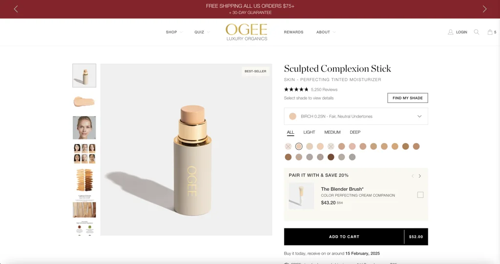
A focused product-page and cart-drawer engagement, shown through the original portfolio capture. No unmeasured commercial uplift is attached to the work.